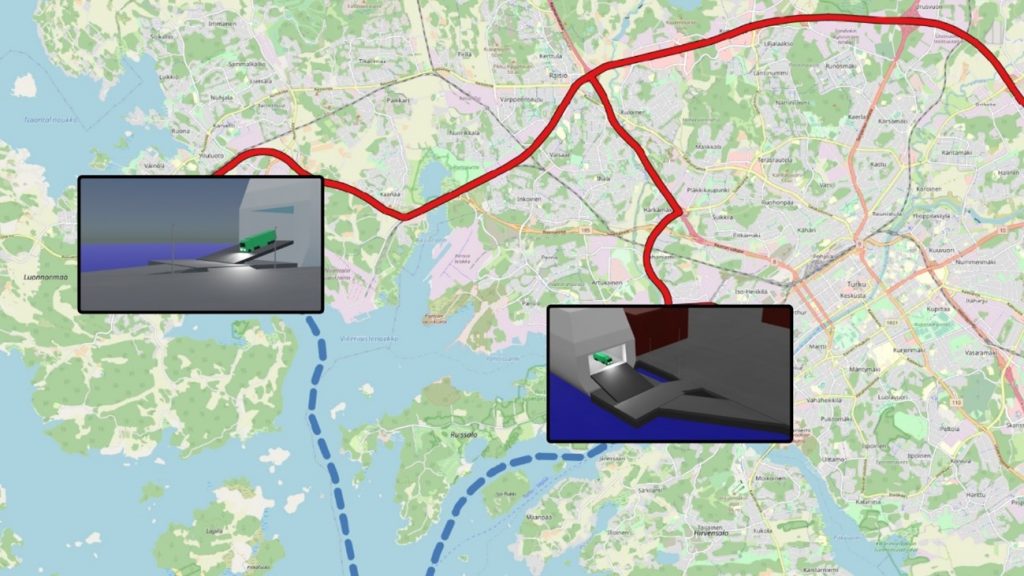
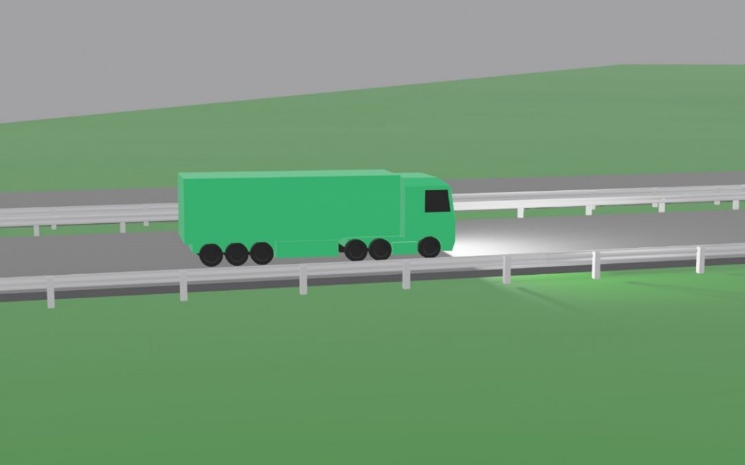
Continuing the project, TUAS from Finland intends to visualize the southern corridor by animating the entire route from the Turku port to the Russian border (Vaalimaa) to clearly show cargo traffic bottlenecks that are closely related to the time spent on the road, as well as other characteristics. The visualization will conclude several topics emerged during the project like bottlenecks, total travel time, total distance, total production of carbon dioxide emissions, as well as possible time saving without bottlenecks and possible reduced carbon dioxide emissions. The visualization will clearly indicate the specific problem areas in the corridor. With the knowledge of bottlenecks and different indicators, there will be a full understanding, what kind and why some challenges have occurred in the corridor. When all possible bottlenecks will be removed, potential time savings will be highlighted to emphasize the potential benefits if the problem points were addressed. The video is currently being created and it will be available for everyone to watch.

The main task of the visualizer is to present the data in a clear and informative way. An example of visualization is a map, which contains very versatile information that can be displayed in one place in a convenient and easy-to-understand way. The information can be in numeric format, as a report, or anything else. Traffic visualizations can help researchers and others interested in understanding the situation relatively quickly – they can reflect characteristics such as traffic density, cargo movement or locations of bottlenecks on the map. This has a significant advantage to authors, researchers and other third-party members to have a fully presented detailed view of the topics. One of the most important part in the visualizations are the results which are comparable to each other. This is a powerful tool to observe different situations in wide perspective. This method has been used also in several Baltic Loop visualizations.


